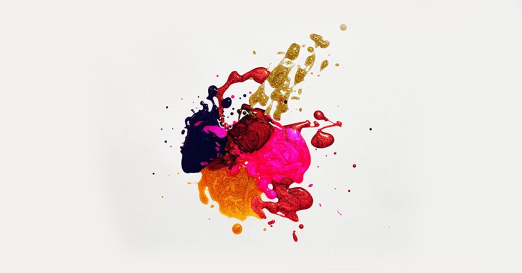



The Core of Great Design
Effective design rests on eight core principles; Balance, alignment, emphasis, proportion, movement, pattern, contrast, and unity. Knowledge of these fundamentals is the stepping stone of the craft, and mastering them is what separates deliberate, professional work from guesswork. These are the same principles I was trained on at AAA School of Advertising, and they show up in every project I take on. from Mercedes-Benz campaigns to smaller passion work.

The video from Art Heroes effectively shows the basic principles of design. These are the building blocks for any creative piece. We will go more in-depth into these below and discuss them one by one to get a better understanding.
These principles are paramount in every design you’ll create. As the saying goes, “to break the rules, you first need to know the rules.” They’re how we master the craft and push its boundaries.
The 8 Fundamentals of Effective Design
Below are the 8 principles every designer needs to know. They can be applied together or individually, depending on what a design calls for, but consistently applying them is what ensures clean, professional results.
- Balance – A distribution of equal visual weight.
- Alignment – An arrangement forming a straight line.
- Emphasis – An accentuation of importance.
- Proportion – A scaling of objects in relation to each other.
- Movement – A directed path of optical motion.
- Pattern – An orderly repetition of an object.
- Contrast – A juxtaposition that accentuates difference.
- Unity – A harmonious arrangement of elements.
One of the most significant design principles is to omit the unimportant in order to emphasize the important.
Dieter Rams

1. Balance: Distributing Equal Visual Weight
Balance gives a design its form and, ultimately, its stable structure. The weighting of elements either equally or asymmetrically. It doesn’t necessarily mean equal height or weight; it means a pleasing unison between elements, where no single one overpowers another. Symmetrical balance weighs objects evenly on either side of a design, while asymmetrical balance uses contrast. Dark versus light, negative space versus used space.
The goal of balance is simple: make a design feel stable and considered, rather than flimsy or unappealing to the eye.
2. Alignment: Creating Order and Structure
Alignment creates more ordered designs by connecting elements through layout and symmetry. It’s why most magazines and newspapers feel clean rather than cluttered, with every element working in unison. Adjusting elements to sit on the same axis groups objects together and creates a pleasing sense of order, which matters most when a design needs to stay simple yet effective.
One of the most common mistakes designers make is failing to ensure objects fall on a straight line or in clear relation to the rest of the elements. When that’s off, it sticks out immediately.


3. Emphasis: Guiding the Eye to What Matters
Emphasis is about deciding what a viewer sees first, and letting everything else support that. The golden ratio is a common tool for this. Used to draw the eye to the text or object that matters most, before letting it drift to the rest of the design. In the example above, the jellyfish clearly jumps out against a plain gradient backdrop. Emphasis achieved purely through contrast, where a simple background pushes the main subject forward.
Other ways to achieve this include weighted elements, contrasting colors, or a mix of blurred and focused sections. for example, keeping the main subject sharp while everything else falls slightly out of focus.
4. Proportion: Getting Scale and Size Right
Every part of a design, objects in relation to each other, and the negative space surrounding them contributes to the sum of the whole. Each element’s weight determines the weight of the entire design, which is why proportion matters so much for reducing clutter and controlling where emphasis falls.
Another word for this is scale. how elements weigh up against their counterparts.


5. Movement: Directing the Eye Across a Design
Movement is the art of directing a viewer’s eye through a design in a deliberate order. Where to look first, and where to end up. Think of it as the flow of the piece. How elements work together to tell a story from beginning to end, the way a picture tells a thousand words. Done well, it creates an experience rather than a scattered collection of elements.
Movement is also called rhythm. The quality that makes a finished design feel vibrant and alive, with a persona of its own.
6. Pattern: Repetition That Reinforces Consistency
Recurring elements tie a design together and keep it organized, which is why pattern matters so much in branding, where a consistent look and feel is what makes a brand instantly recognizable. Also called repetition, it’s a powerful way to reinforce an idea. Repeating an element signals its importance and justifies its place in the design.


7. Contrast: Making Key Elements Stand Out
Contrast, put simply, means definition. Clearly setting one element apart from another, either to communicate difference or push something to the foreground. Clear contrast creates depth and separates your subject from the rest of the visual. A faded background with bright text on top, like the hero banner on this post, is a simple example. The background stays present without competing for attention.
This is one of the most useful principles you’ll reach for. In short, it’s the deliberate use of conflicting elements that still work together harmoniously.
8. Unity: Making Every Element Feel Connected
Unity defines how each element relates to everything else in a design. Whether it’s out of place, or works in harmony with the rest of the composition. It’s the factor that most clearly separates low-standard design from quality creative work. Every element should serve a purpose. If something is out of place, merely added as a space filler, it disrupts the entire piece. Get unity right, and the result is cleaner negative space, more purposeful elements, and a genuinely polished final product.
This is also called harmony. Elements that clearly work together instead of competing for attention.

Final Thoughts: Why These Principles Matter
Frequently asked questions
What are the principles of design?
The core principles of effective design are balance, alignment, emphasis, proportion, movement, pattern, contrast, and unity. Together, they govern how visual elements relate to each other on a page, whether a design feels stable, ordered, and intentional, or cluttered and accidental. Professional designers apply these principles together or individually depending on what a project calls for, and mastering them is what separates deliberate work from guesswork.
What's the difference between symmetrical and asymmetrical balance?
Symmetrical balance weighs elements evenly on either side of a design, creating a formal, stable feel. Asymmetrical balance uses contrast instead. Dark versus light, or negative space versus used space to even out visual weight without mirroring elements directly. Neither is inherently better; the choice depends on whether a design calls for a formal structured feel or a more dynamic informal one.
Why is contrast important in graphic design?
Contrast creates definition by clearly setting one element apart from another, which is what allows a viewer’s eye to separate a subject from its background or identify what matters most in a composition. Without enough contrast, elements blend together and a design loses depth and hierarchy. It’s one of the most reliable tools for making a key element like a headline or a focal image actually stand out.
What's the difference between pattern and unity in design?
Pattern refers to the repetition of a specific element; a shape, color, or texture used to reinforce consistency and recognizability, especially in branding. Unity is broader. It’s about whether every element in a design, patterned or not, relates cohesively to everything else. A design can use pattern without achieving unity if other elements still feel out of place or disconnected from the whole.
What is emphasis in graphic design, and how do you create it?
Emphasis is the principle of directing a viewer’s eye to what matters most in a design before letting it move to secondary elements. It’s commonly created through contrast (a bright object on a plain background), scale (making one element larger than the rest), or selective focus (keeping a subject sharp while blurring everything else). Good emphasis means a viewer knows exactly where to look first without needing to be told.
How many principles of design are there, and do you need to use all of them?
There are 8 widely recognized principles of design. Balance, alignment, emphasis, proportion, movement, pattern, contrast, and unity. Not every design needs to apply all 8 equally. Some projects lean heavily on contrast and emphasis, while others prioritize pattern and unity for a cohesive brand look. What matters is understanding all of them well enough to choose deliberately, rather than by accident.
What's the difference between the principles of design and the elements of design?
The elements of design are the raw building blocks. Line, shape, color, texture, space, and form. The principles of design (balance, alignment, emphasis, proportion, movement, pattern, contrast, and unity) are the rules for how those elements are arranged and combined. In short, elements are what you’re working with, principles are how you organize them into an effective design.